


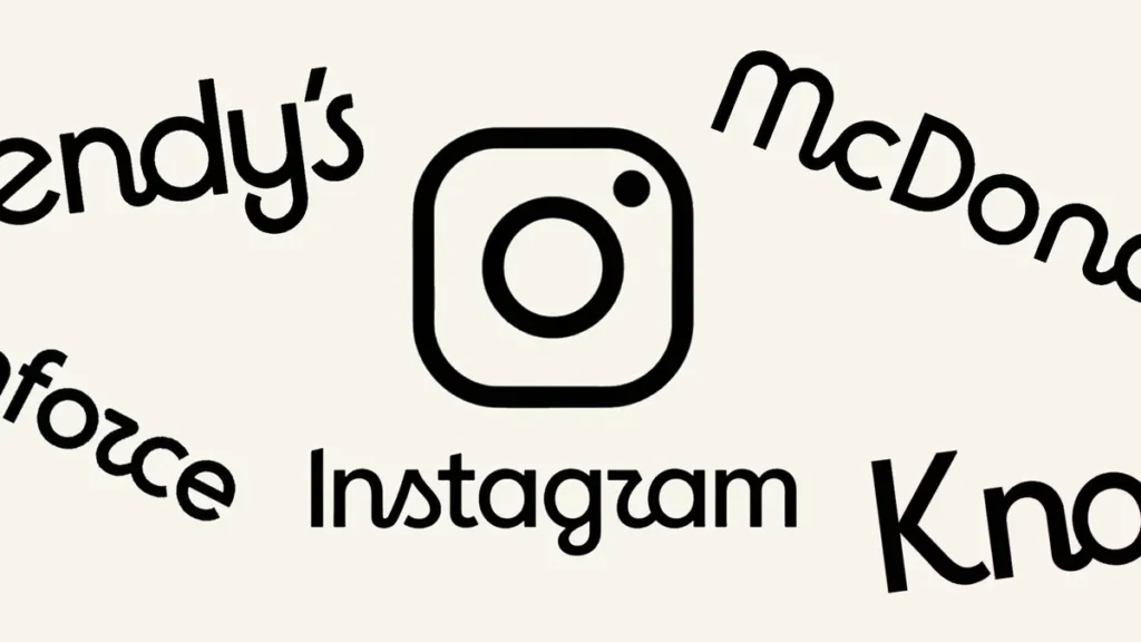
Instagram is changing its look.
The social platform has revealed an updated wordmark and wider brand system, giving Instagram its first notable branding refresh in more than a decade. The change isn’t a complete reinvention of the familiar Instagram identity. Instead, the company has taken what users already recognize and given it a sharper, more contemporary finish.
Instagram chief Adam Mosseri shared an early look at the refreshed branding, explaining that the previous wordmark had started to feel dated. The new version keeps ties to Instagram’s original visual style while moving toward something cleaner and more modern.
Instagram’s New Logo Keeps the Familiar Look, but Changes the Details
Instagram hasn’t thrown away its identity and started from scratch. That’s probably the most noticeable thing about this update.
The new Instagram logo and wordmark still feel immediately connected to the app people have been using for years, but the typography has been reworked. Instagram says the updated design is intended to feel sharper while retaining the simplicity and craftsmanship associated with the brand.
It is a subtle type of redesign. And subtle redesigns can sometimes generate more debate than dramatic ones because everyone notices the tiny differences.
The Instagram Brand System Is Changing Too
This isn’t only about the name sitting at the top of the Instagram app.
Instagram has also introduced an updated brand system featuring new fonts, icons and formats. That gives the company a broader visual framework for how Instagram appears across the app, marketing material and other places where its branding is used.
For marketers and businesses, that’s the part worth watching. A refreshed Instagram identity eventually filters into brand guidelines, promotional graphics, social buttons, website icons and plenty of small design elements that tend to sit untouched for years.
Some businesses may want to check those old Instagram icons sooner rather than later.
Not Everyone Likes Instagram’s New Wordmark
Naturally, Instagram users noticed.
Mosseri’s announcement posts on Instagram and Threads attracted more than 5,000 combined replies by the time Social Media Today published its report on August 13, 2026. A noticeable part of the criticism focused on the new lettering, particularly the stylized lowercase “r,” which some users thought looked more like a “z.”
Other reactions had almost nothing to do with typography.
Some users used the announcement to complain about Instagram’s broader product experience, including the way content from followed accounts appears in the feed. That’s fairly typical for a platform redesign. Announce a font change and suddenly the replies become a referendum on the entire app.
Does Instagram’s New Logo Actually Matter?
For someone opening Instagram to watch Reels, message friends or check posts, probably not much.
A different wordmark isn’t going to fundamentally change how Instagram works. It could, however, make the platform feel slightly newer without forcing Instagram into a dramatic visual overhaul that users have to relearn.
Branding changes also tend to make more sense when viewed over several years rather than several days. Instagram’s previous wordmark had been around for more than a decade. Even a relatively small adjustment becomes significant when billions of people recognize the brand.
There’s another question hanging around the update: is the branding refresh arriving ahead of bigger Instagram changes?
Nothing announced so far confirms that. Social Media Today noted that, for now, the visible change may largely affect Instagram’s title display rather than signal a massive redesign of the app.
Still, platforms rarely stop changing for long.
Brands Using Instagram May Need to Update Their Assets
Businesses, publishers and creators should pay attention even if ordinary users don’t care much about Instagram’s typography.
Instagram icons appear everywhere: website footers, contact pages, media kits, email signatures, advertising material, creator graphics and downloadable brand assets. Once the refreshed Instagram branding becomes standard, older graphics can slowly start looking outdated.
There’s no need for a frantic redesign of everything carrying an Instagram icon. But it is worth adding to the next website or branding cleanup.
Instagram has changed its clothes a little. The internet, predictably, has opinions.